
BLACK AND WHITE AND RED ALL OVER
28 February - 30 May 2018
Black and White and Red All Over features JAHM’s collection of black and white works mounted on blood red gallery walls. The title of the exhibition is the old well known newspaper joke and the show aims to explore the role that black and white plays, not only in artistic expression, but also in our history and society. The presence of polarities in today’s discourse, it's either black or white – as reflected in left or right, rich and poor, secular and religious, and liberal and fundamentalist. Critical and popular is eliminating the grey, as well as the nuance and subtleties in between. This exhibition explores this phenomenon.
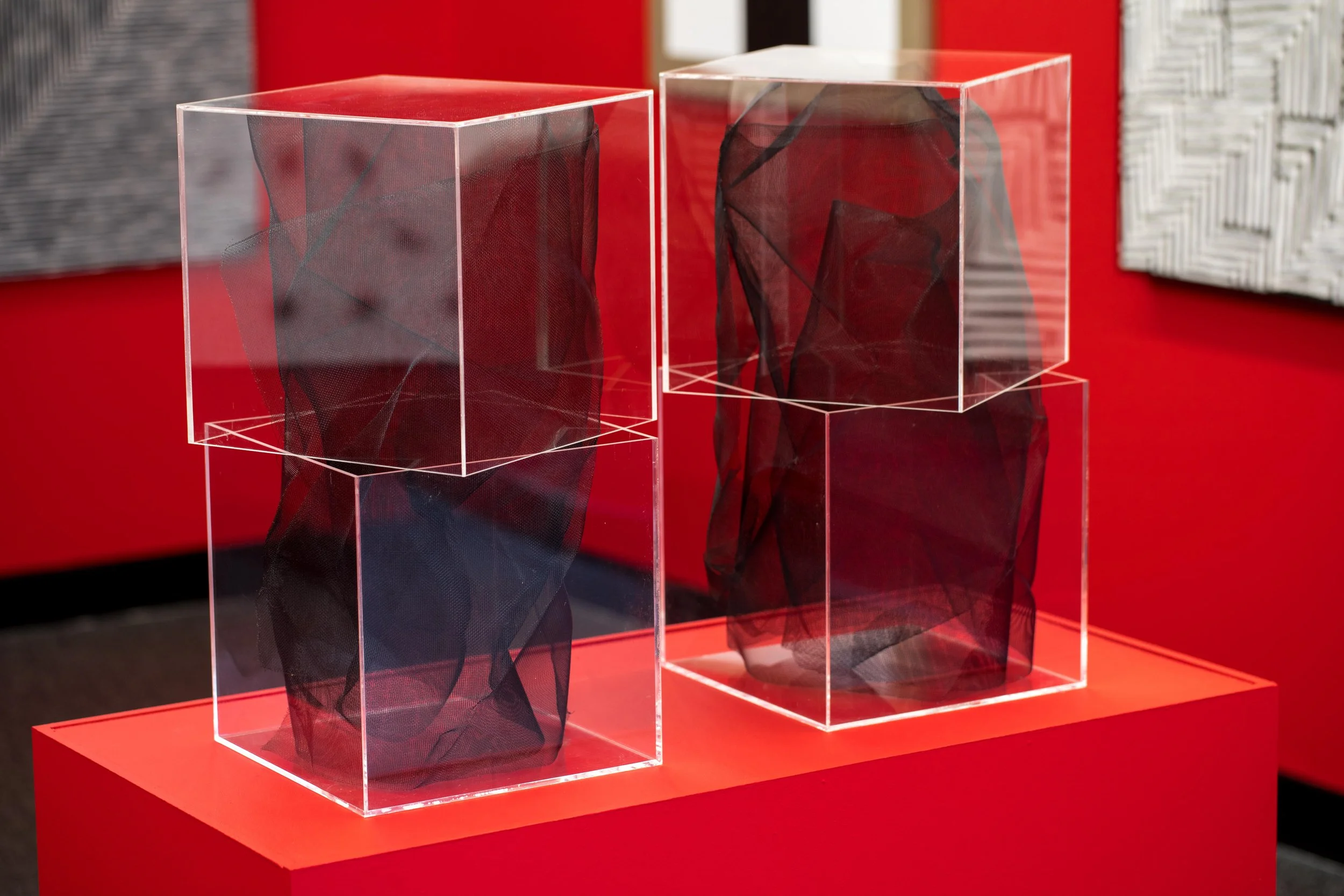
EXHIBITION VIEW


EXHIBITION CATALOGUE
Mobile users: Tap the small white icon in the bottom-right corner of each work for details.
Photography by James Morgan


CURATORIAL ESSAY
Peter Hill’s Black and White Travel Diary
to be re(a)d in fragments
One of many stories I happily tell against myself concerns Picasso’s passionate anti-fascist statement – anti-war statement - the painting Guernica. I was a young, long-haired, art student, still learning, barely able to tell his Dali from his Duchamp, although over-enamoured by the former as later in life I would be by the latter. It was the early 1970s. Cat Stevens’ Moonshadow seemed to be playing from every jukebox and radio speaker, the sun shone endlessly, and even more bombs were falling on Vietnam and Cambodia than had destroyed the Basque town of Guernica. The German air force saw it as a technical experiment to try out their new bombers from their Condor fleet.
I was studying painting at the wonderfully named Duncan of Jordanstone College of Art and Design in Dundee. One day, queuing in the art school’s factory-like canteen for a plate of battered haddock and chips, I remarked irritably to an older and far wiser student that no matter what book I took out of the library with images of Guernica in it, they were all in black and white.
“I’ve never seen a single reproduction in colour,” I complained, “and it’s supposed to be an important painting.”
“That’s because it was painted in black and white,” my wise old friend – who must have been all of twenty-two – replied disdainfully. He didn’t actually add the words “You fool”, but they were there by implication, and I could feel my youthful cheeks redden with embarrassment.
But why would Picasso, whose works were known for their exuberant colour, choose to paint his masterpiece in black and white?
The polarity between Black and White always raises interesting questions. Some concern art. Others, our very existence as sentient beings. Add the colour red into the mix and the questions are only amplified. The undoubted seriousness of the subject is undercut with humour, as in the old newspaper saw of “black and white and read all over.”
November 2017: I’m striding across Trafalgar Square on a cold, early winter’s night. David Shrigley’s optimistic “thumbs up” sculpture towers skywards from the Fourth Plinth, next to Nelson’s Column. I’m on my way to see the newly opened Monochrome: Painting in Black and White at the National Gallery.
The lesson from both Guernica and Really Good is that art holds a mirror up to the polarities of trauma and comedy equally well, with equal empathy for its very different types of subject matter and felt emotion. But what if that subject matter is abstract, even non-referential, rather than figurative? What if they were devoid of colour, but seen against a red background? These were the thoughts that were playing tag in my mind as I entered the doors of the National Gallery and picked up the catalogue for Monochrome that the press office had kindly left for me behind the front desk.
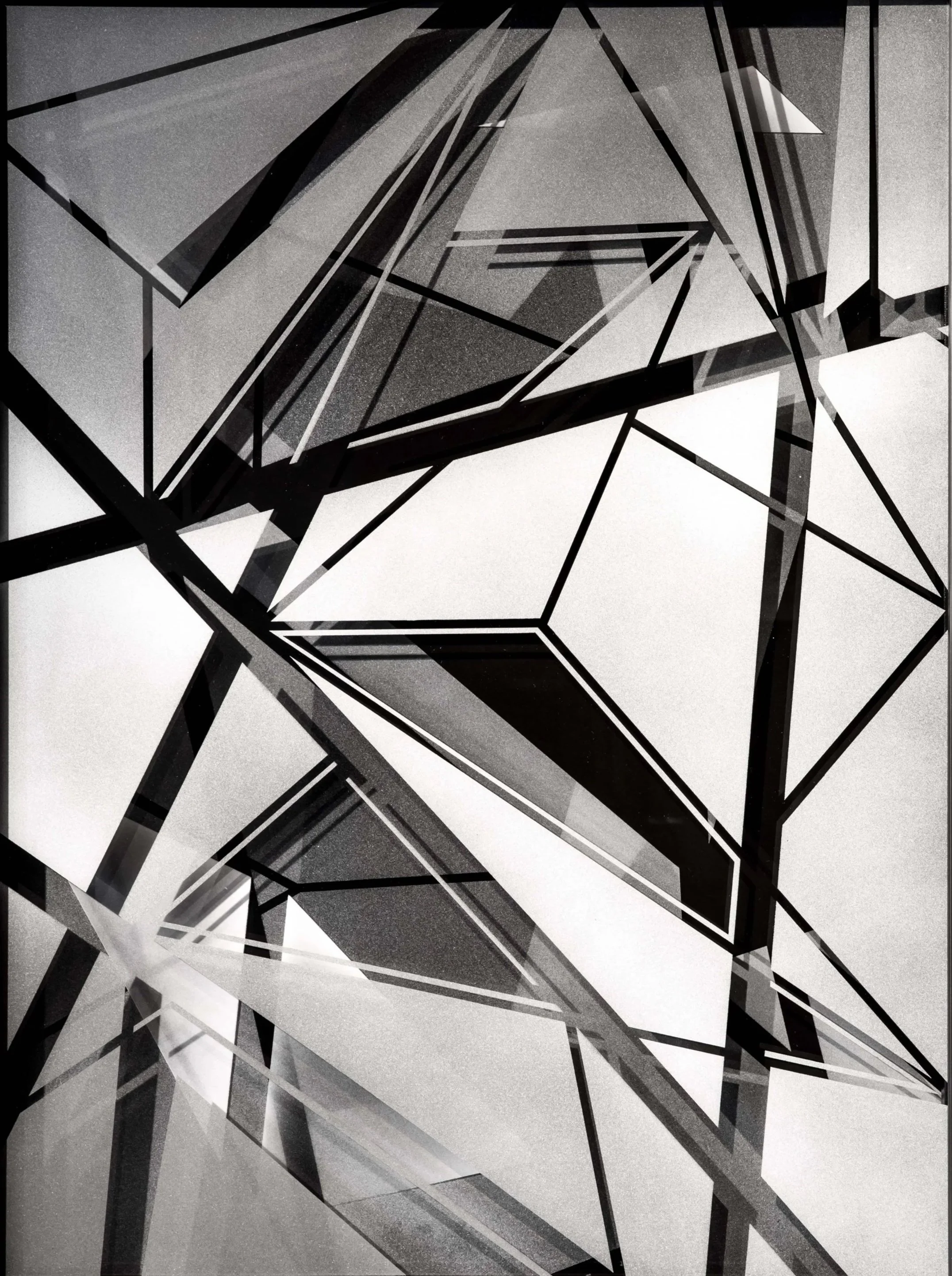
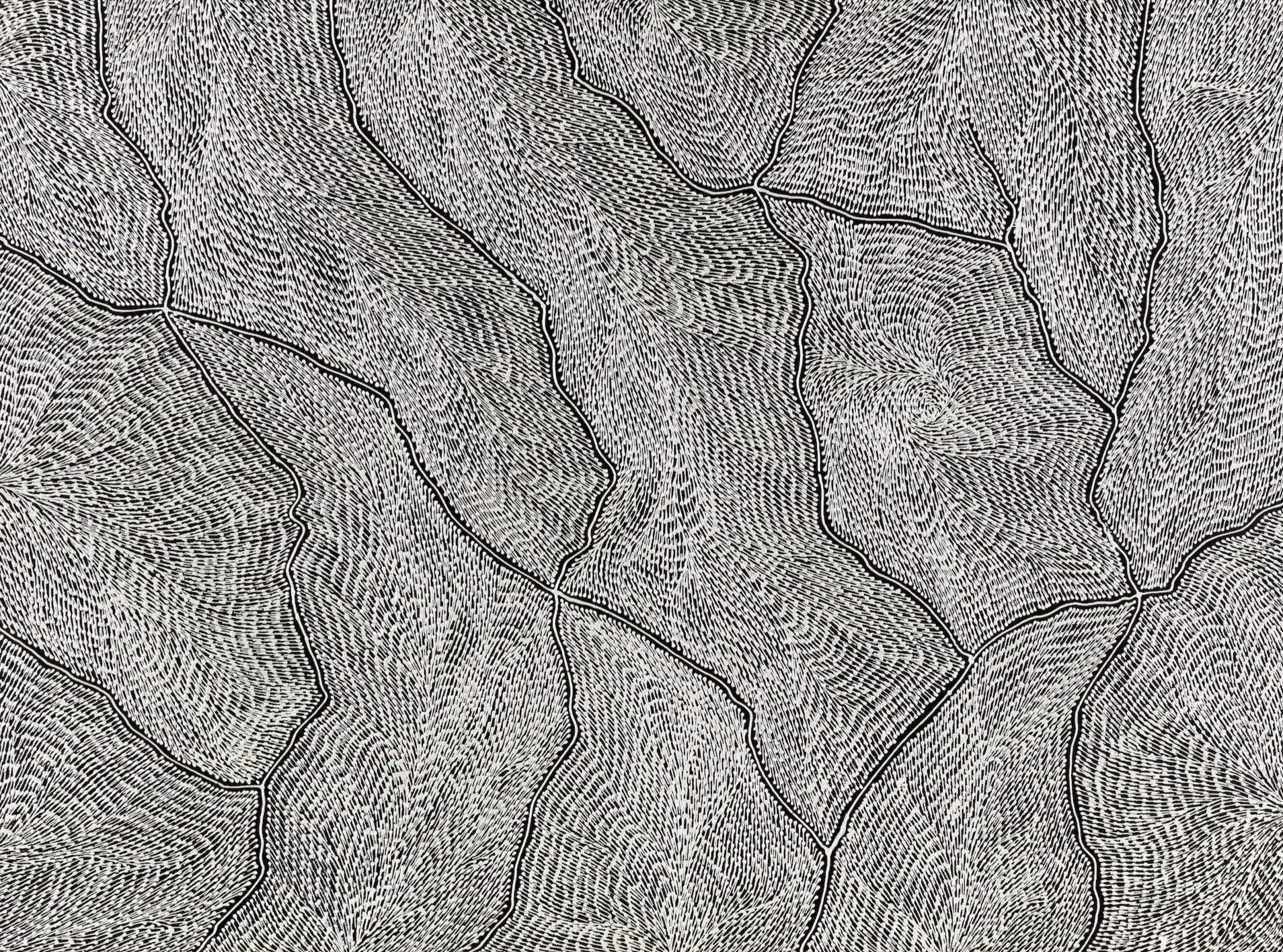
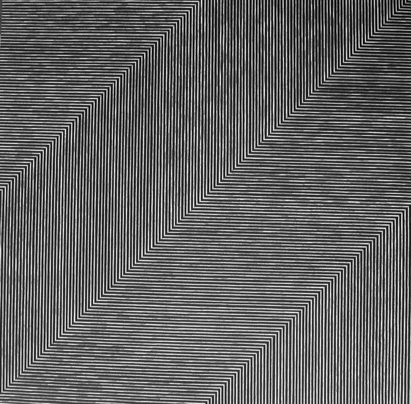
I was doubly excited about seeing this exhibition because – one of those pleasing coincidences – Charles and Leah Justin had, only a few days before, emailed me from Melbourne to tell me that their next exhibition would contain most of the black and white works from their collection – all abstract, and we will come to definitions of abstract soon - and invited me to write the catalogue essay. I’d last seen them six months earlier when I started a crazy, two-year round-the-world lecture tour titled Fake News and Superfictions at their eponymously named Justin Art House Museum in Prahran. I’ve visited JAHM many times, and in advance of them sending a drop-box of images, I tried to remember, as I crossed the entry hall of the National Gallery, the many black and white works I’d already seen, either on the walls of their apartment or in catalogues in their always-tempting library. There was Magda Cebokli’s Ring#1 (2011), a white circle against a black ground like a free-floating Socratic form. The Aboriginal works of Sarrita King, Elizabeth Marks Nakamarra, Anna Price Pertyarre and others are abstractions that also describe narratives, grounded in the land and a sense of country. And so we see that “abstraction” is also linked to figuration, two polarities combined. It is abstracted from the world around us, our perception often aided by the title the artist has chosen, as in John Gollings Bushfire Aerials (2009), and Michael Staniak’s Untitled (Digital Face) (2008) in which a dark face emerges from a dark ground with all the nuance of an Ad Reinhardt black cruciform on a black canvas. In Reinhardt’s work the contrast is so subtle between figure and ground as to be almost invisible. The human eye, given a long enough exposure, can just discern it, while the camera lens cannot. Other works in the exhibition will, I’m sure, be polar opposites in their tonal range – the stark contrasts of a PJ Hickman, Richard Blackwell, Tracey Coutts, or Dion Horstmans. In others, there will be unintended commonalities, as in the rectangular forms used by New Zealand-born Yioryios in his work Discarded No 8-11 (2013) and the similarly rectilinear print by his compatriot Daniel Von Sturmer, iPhone 5 (with cover) (2013). I awaited the arrival of the full set of images to jag my memory into further action.
Any meditation on black and white – and its minimalist handmaiden monochrome – must also be a reflection on the nature of colour. Wittgenstein’s great book, Remarks on Colour, written in his signature style of numbered paragraphs, flashed into my head as I checked my bag and hefty catalogue into the National Gallery cloakroom. As I walked towards the first gallery my memory, unbidden, threw up recollections of my old friend Albert Irvin one of the world’s great abstract painters who died in 2015 at the age of 92. Google his images and be astonished. In his obituary in The Guardian, Mike Tooby wrote about how “Irvin trained in Canada as a navigator. From 1944, he flew bombing missions with 236 Squadron over Germany. The camaraderie was important, as was the experience of flying over the landscape with map in hand, but he never escaped the memory of the destructiveness of their purpose.” Memories again of Picasso and Guernica and the strange thought that German artist Joseph Beuys (born 1921) was in the Luftwaffe and – who knows - may have been shot down by Albert Irvin’s (born 1922) plane.
All this gave an urgency to Irvin’s life and career after the war, silkscreening Laura Ashley’s early fabric designs to support his art, and having his first major successes in his sixties. His colourful work would look quite at home in the Abstract 18 exhibition, currently installed in Charles and Leah’s apartment. He was a brilliant teacher, and generations of art students found real artistic enlightenment at the colour workshops that he ran. Many of these focused on the power of black and white, and how easily it could fool the human eye. Colour is seductive, but black and white – tonal values, one of the hardest things for young art students to understand and to use effectively – are the structure, the scaffolding, of all good art practice from charcoal drawings to filmmaking (think of the great black and white images created by Sergei Eisenstein from his masterpiece Battleship Potemkin, with music by Dmitri Shostakovich that so inspired the paintings of Francis Bacon).
Albert Irvin would talk about black whites, and white blacks. Like a conjurer, in a studio full of props, he would show the students a scrap of white paper and then let it fall on an even whiter piece of card on the floor, where it immediately turned dark grey. A shard of what appeared to be black card, when dropped onto a truly Guinness-dark roll of paper, magically turned - if not white - then certainly a very light grey.
All these thoughts in an instant – Wittgenstein’s academic theory confronted by Uncle Bert’s (as we all affectionately knew him) decades of practice - looking at the world, deconstructing it, rebuilding it in abstract ribbons of colour which, when they were occasionally reproduced in black and white – as I once thought Picasso’s Guernica had been – “worked” tonally through the whole range of darks and lights, like a jazz piano revealing all the secret grey notes hidden between the ivory and the ebony. Later, Charles and Leah would remind me of the book The Secret Lives of Colour, by Kassia St Clair and a particular Zen-like passage that fascinated them, dealing with the difference between light and pigment: ‘Mixing coloured light makes white, while mixing coloured paint makes black, lies [at the heart of] the science of optics. Essentially there are two types of colour mixing: additive and subtractive. With additive mixing, different light wavelengths are mixed together to create different colours, and when added together the result is white light. However, the opposite happens when paints are mixed. Since each pigment only reflects back to the eye a proportion of the available light, when more and more pigments are mixed together, more and more wavelengths are subtracted. Mix enough together and very little of the visible spectrum is reflected, so we will perceive the mixture to be black.”
Monochrome: Painting in Black and White turned out to be a curate’s egg of an exhibition. Those parts which were good were very good indeed. Others not so. Where the wheels fell off the clearly defined thematic was at the point the curators veered from their stated purpose. In short, there was too much colour in the exhibition – even if you discount the final room that was all colour, the immersive neon yellow light installation of Olafur Eliasson Room for one colour (1997).
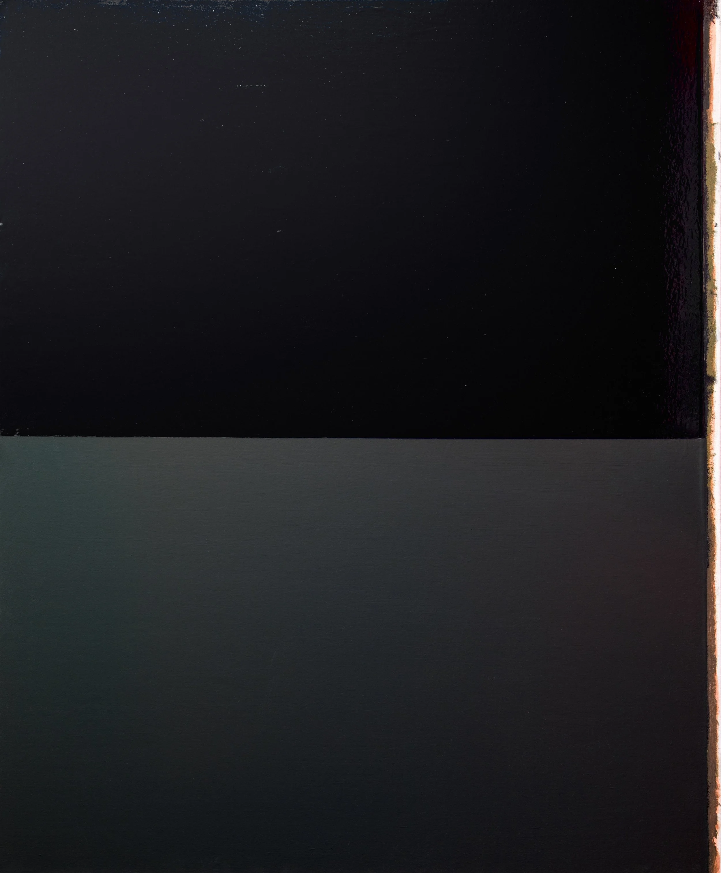
For me, the high point of the Monochrome exhibition was the penultimate room. In the catalogue, which I rifled through on the tube back to Elephant and Castle, this section was called “Abstraction in Black and White” and included knee-trembling paintings by Kazmir Malevich, Josef Albers, Jackson Pollock, Cy Twombly, Bridget Riley, Gerhard Richter, Frank Stella, and Jasper Johns. Richter’s triptych Grey Mirror - 765 (1992) was a fine, and subtle, example of a very-much-intended blending blending of the abstract with the figurative. The materials listed are “Pigment on glass” in the sort of equivocal dark grey that would have delighted Uncle Bert in his studio workshops. When your eyes have become accustomed to the almost-blackness, you then become aware of the rest of the gallery reflected in its surface. Your mind knows that what you are looking at is two dark, rectangular panels. But your eye and brain picks up (and is meant to) reflections of other canvases, and the geometry of the room itself. This is not a chance occurrence, the artist knew exactly what he is doing with the subtleties of reflection, just as Melbourne artist Aaron Martin’s work does in his highly-reflective monochrome paintings. Both artists set up a polarity between “mind” and “brain”, that reminds me of the old adage, “Knowledge is knowing that a tomato is a fruit and not a vegetable. Wisdom is not putting it in a fruit salad.”
Making art is about taking risks. So is curating. And collecting. If you don’t risk failing, how can you succeed? Failure/Success, another two polarities, grinding against each other like pistons. An exhibition of black and white artworks exhibited against white walls, is a very different exhibition from one on red walls (and an exhibition of black and white abstract art is very different from one of black and white figuration).
When the late Howard Hodgkin represented Britain in the Venice Biennale in 1988, he stipulated that the walls should all be painted a very precise shade of green (you can hear him talking about this decision on: https://vimeo.com/13056570). When I saw it, I felt the green on the walls killed the subtleties of the colours on his canvases. The following year I saw exactly the same exhibition at the Whitechapel Gallery in London but this time against sugar-white walls. And the colours sang. But it was a brave risk to take and I am glad he did it. There are many reasons – aesthetic, cultural, social, associative, and not least sensory – why black, white, and red work well together, and succeed in immersive gallery installs where Howard Hodgkins’ did not. You can see it in the works of Jenny Holzer and of Barbara Kruger, in the use of “spot” colour in advertising and graphic design, and in political propaganda.
If curating involves risk-taking, then collecting art often requires quick decisions being made. And in talking to collectors you soon realise that behind every artwork there is a story, often involving travel. In the age of the internet, there is invariably a website too. This is true, I’m sure, for every artwork in this exhibition. One example of this came in an email from Charles.
“We bought Liat Segal and Roy Mayan’s Plate recorder #8 on our recent trip to Israel. It consists of a white ceramic plate with a black glaze that’s engraved by a device similar to the arm of a record player driven by an algorithm that converts sound into movement, causing the arm to zig-zag over the plate, creating a pattern that is a physical manifestation of the sound, in this case the theme song of a local football club. Check out her website www.sweet-tech-studio.com";
“The Nazi flag was black and white and red all over,” Charles Justin tells me a few weeks later. He, Leah, and I are sharing a meal of meat, noodles, and vegetables on the Saturday before Christmas in a restaurant next to IKON gallery in Birmingham. We’ve been discussing the rise of abstraction and the rise of Fascism – both of the left and right. “There was a definitive break from reference or allusion to pure abstraction after Malevich,” Charles continues, “with the idea of concrete art, a pure method of artistic expression which transcended representations of the real world. It’s interesting that both Hitler and Stalin both banned modern art, particularly abstraction, and both pushed for nationalist realism as the state approved style of expression.”
It’s been a week of snow, ice, and plummeting temperatures. We’ve just been warmed, however, by the great narrative arc of the life and work of engraver and miniaturist Thomas Bock in the nearby IKON. Born in Birmingham, transported to Van Diemen’s Land for “administering concoctions of certain herbs…with the intention to cause miscarriage”. There, he produced keenly observed portraits of the local Tasmanian Aboriginal people, now held in the British Museum. White exiled convicts thrown into an unplanned dance with the black inhabitants of this land and their unbroken culture stretching back forty, fifty, sixty thousand years. Colonial puppet masters pulling the strings of convicts and koories alike. The History Wars – one of the many cultural polarities, operating on several levels of truth and falsehood, are still being played out today and still need to be dealt with.
By now, I have received the full set of images and list of participating artists, and I can see it is both inclusive and fascinating in its juxtapositions. Pan-cultural similarities entice, as in the formal qualities that link, say, Lily Kelly Napangardi (born Haasts Bluff in 1948, moved to Papunya in the 1960s) to the Japanese artist Eiko Odawara. Intriguing questions are raised. How will Ian Wells’ Glass Drawing #3 (2013) and Zac Koukoravas’ Modular Suspension (2016) chime with the thoughts I have been having on Richter and Martin. Koukoravas’ work is painted on to glass and acrylic with all the possibilities for deliberate and accidental reflection. How will Shelley Jardine’s Void Meets Perception 2 (2016) relate the work works in close proximity to it. And will there be a resonance between Tracey Coutt’s Grid Line Colour Fill #1 (2016) and Stephen Bram’s Untitled (two point perspective) (2011)?
Back in the restaurant, our attention is now fully focused on the upcoming exhibition. But now we are more centred on the philosophy behind it, rather than the hang, and the personal choices informing the theme.
“The birth of modernist architecture paralleled that of the birth of abstraction,” Charles gives me the backstory to their chosen theme, as Christmas diners wearing scarves and gloves come and go, with armfuls of presents and last-minute shopping. “Both had that strong reductionist quality. Compare Malevich’s Black Square to Corbusier’s Villa Savoy, one black and one white, but both representing the utopian ideal of a new world created by man- a world of simplicity, honesty, transparency, equity. The sinister reaction to this utopian ideal was the Nazi concept of the master race, which by definition was all about polarities. Black and white figured strongly in the symbols by which they represented themselves, such as the black SS uniforms and the Nazi flag.” More polarities.
There must also, I reflect, have been personal choices made, first in conceiving the exhibition, then in its selection and personal influences?
“That’s right,” Leah enthuses. “Our love of black and white in artworks, and all the polarities this creates and references, crept up on us. In the beginning, we didn't have a grand plan to collect, and in fact we respond viscerally as collectors. Setting up the exhibition has forced us to reflect on what were the prompts for the large number of black and white works. No definitive answers emerged, but they do suggest that the black and white works were deeply affecting and have allowed us to engage with the purity of the form. After all, the first colours we respond to as babies are black and white. Bizarrely, these black and white works are somehow enriched with the colour of our individual emotions and feelings.”
Soon we are bouncing ideas around about creativity, existentialism, and religion. “By creativity,” Charles becomes ever more precise, as our coffees are carefully placed in front of us by a Korean waitress, “what I’m talking about is the capacity of humans to take an abstract idea and realize it in a physical form that can be experienced by others. So, it covers architecture, art, technology, music, literature and whatever is made by humans in the world we live in. It doesn’t refer to the sort of conversations you and I have had before about birds’ nests and beavers’ dams.”
I can empathise with this. My own father was a scientist with deeply held Christian beliefs, and I have grown up being able to hold often opposing views within my own head, very often mediated by art and the power of creativity. As a young child - and this memory has just floated to the surface of my consciousness unbidden, as if some mooring has slipped free in the antediluvian depths of my unconscious - I often used to fall asleep dreaming of a three-sided glass pyramid, slowly revolving in the blackness of deep (inner) space, with each of those cubist-like planes representing, in turn, Art, Science and Religion. Once fully asleep, I’d revert to my usual Looney Toons-type cartoon dreams, inspired by Warner Brothers and the Hannah Barbara studios, often featuring Road Runner or Mr Magoo, in tropical colours, navigating the black and white mean streets of Glasgow.
Before we leave the restaurant to visit another exhibition Coming Out: Sexuality, Gender and Identity at the nearby Birmingham Museum and Art Gallery – with an intelligently curated range of contemporary and modern artists: Andy Warhol, Sarah Lucas, Grayson Perry, David Hockney, Francis Bacon, Steve McQueen, Derek Jarman, Sunil Gupta, Chila Kumari Burman, Richard Hamilton, Gillian Wearing - our conversation turns to our respective youths. In my own case, a young hippy art student who went off to work as a lighthouse keeper on three islands off the west coast of Scotland. Leah remembers hers, “I grew up in the 60's, a wonderfully liberating fashion era where anything went. Flower power and three- piece-suits and ties coexisted. I was drawn to clothes that had strong geometric forms, matched with equally strong vibrant colours. Fresh, bold and energising.” I immediately see the appeal to Leah of works such as Module no. 24 geometric city (2006) by Don De Ieso, Kivos No 8 by Chris Rak, Electronic document campaign (study) (2009) by Justin Andrews, and the video projection by Nancy Lang, In sync: collecting movements (2016, 6.37 mins).
“In those days, I didn’t know that less was more,” Leah continues. But I always was, and continue to be, drawn to black and white clothes - a canvas upon which I can create my own look. Accessories were important, as they are now. My grandchildren even exclaimed – when they learned the title of this exhibition – that ‘It must be named for you’, as my clothes and jewellery – earrings, and wrist cuffs and bracelets are largely black white and red...they think I simply live the title.”
I catch the train back to my sister’s in Bramhall, outside Manchester, where we will celebrate Christmas. A few days later I will head north to Scotland and catch the ferry to Arran, rising and falling in the eye of storm Dylan. Since farewelling Charles and Leah in Birmingham, I’ve thought of more questions I want to ask about the philosophy behind the exhibition, and we carry on our Socratic dialogue through the wonders of texting.. On the 1st of January 2018, I am sitting in the bar of The Glenisle Hotel in Lamlash, one of the few places apart from the little supermarket that are open, reading through Charles’s latest responses as I sip a hot chocolate and the wind howls across the jetty.
In the Glenisle Hotel I look at the most recent notes from Charles, sitting there in the digital notebook of my iPhone. For a moment, I think about scenes from that great black and white expressionist film – still one of the best films ever made, because it was made by with an artistic sensibility and they were still finding their way, still defining, the new medium – The Cabinet of Dr Caligari, created by Robert Wiene, Hans Janowitz, and Carl Mayer, the latter two converts to Pacifism after the horrors of World War 1. It is a film about polarities, not least sanity and madness, and predicts the rise of Hitler and the Nazi party.
I look down at the screen of my phone, as another message pings in, and can almost hear Charles’s voice:
“The title of the exhibition Black and White and Re(a)d All Over is known universally as ‘the newspaper joke.’ We chose it for two reasons. One to highlight the role that newspapers played in advancing the potential for human expression and the dissemination of information, not dissimilar to what the internet is doing today, and the other being the visual drama we anticipated would be created by our black and white works mounted on blood red walls in our gallery. All the current technologies involved in human creative expression started in black and white- printing, newspapers, movies, TV, computers. It was only after further technological development, many years later, that these technologies enabled colour.” I look at the grainy, laser-printed images of other works in the exhibition, by Russell Dammers, Jan Plapp, Hannah Quinlivan, Jay Kochel, Britt Salt, and the artist duo of Shannon McGrath and Marcus Piper, and try to picture how they will look hanging together, with their differences in scale, materials, tonal values, and individual intentions.
As if stealing my very thoughts, another text pings in from Charles as I finish my drink.
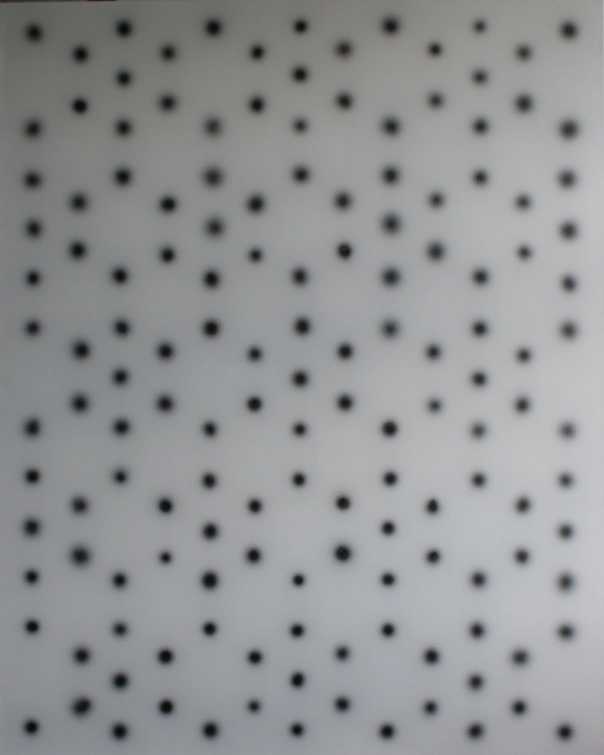
“All the works in the exhibition are abstract. The way the works will be curated is to group them along compositional structures - architectonic, lines, dots and circles, patterns, orthogonal blocks and fractals - each a phrasing within the language of abstraction.” I like the precision here, in Charles’s aide memoire to myself. It reminds me of the exactness of Wittgenstein’s Remarks on Colour, and perhaps unconsciously reveals much about Charles’s love of “hard-edged” abstraction, as opposed to the “looser” variety found in a range of abstractionists from Philip Guston to Ian Fairweather to Cy Twomly.
By 3.30pm it is getting mid-winter dark on Arran, and I have to buy a torch in the Co-op so I can find my way in the pitch blackness across the fields and back to my brother’s cottage. Pladda, the first lighthouse I worked on, back in 1973, is only a mile or two across the bay. In Stargazing, my book about those times, I describe the ambivalence I had about black and white as a child growing up in Glasgow, still rebuilding after the war-time bombing of Clydeside.
“I was born on the 5th of June, 1953. Throughout childhood in Glasgow, everything seemed either black or grey until winter came and things briefly turned white – for much of the year colour didn’t seem to exist at all. Glasgow’s buildings were black with soot from the industrial revolution, so universally black that most of my childhood I unquestioningly accepted that this was the natural colour of stone. Television was black and white, text in books was black on white, crossword puzzles, dominoes, Buster Keaton movies, and all the images from the past, from history, came down to me in grainy death camp black and white.”
I’ve been planning in the New Year to go to the Yorkshire Sculpture Park to see Alfredo Jaar’s Revolt and Revolutions/The Garden of Good and Evil. And as I think about “The Garden of Good and Evil”, I think again about dichotomies and polarities. It was the French anthropologist Levi Strauss who proposed the theory of “binary opposites”, especially how they relate to the media and to film. Young versus old, male versus female, black versus white. Under Barack Obama, it seemed as though we were entering a greyer, more blended, age of politics. Then Donald Trump rode into town. But some of Obama’s legacy survives, particularly in the non-binary blending of gender choices that we are seeing in our youth today.
Another strange coincidence. Just as I am typing these last few paragraphs, now at my brother Robin’s in Longniddry, outside Edinburgh, an email drops into my inbox from Charles, with the sad news that Leah’s mother has just died, at the grand age of 94. The funeral will be tomorrow. That greatest of polarities, life and death, united only by love and memory. In a future email Charles will remind me that while in Western cultures death is represented by black, symbolising extinguishment, in Eastern cultures it is represented by white and the opposite polarity of light, purity, and enlightenment.
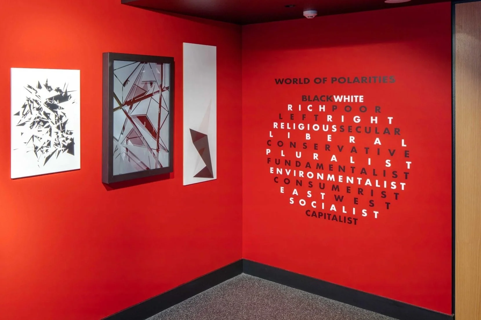
Charles also attaches some stunning images of the install in progress, and the wall text which, applied in the shape of a sphere, presents a series of well known polarities under the rubric:
WORLD OF POLARITIES
RICHPOOR
LEFTRIGHT
RELIGIOUS SECULAR
LIBERAL
CONSERVATIVE
PLURALIST
FUNDAMENTALIST
ENVIRONMENTALIST
CONSUMERIST
EASTWEST
SOCIALIST
CAPITALIST
Soon I will return to Australia, flying around the right cheek of earth - to evoke the sentiments of Les Murray - and I will at last experience this exhibition “in the flesh”. The one work I am most keen to see is Architect (2005) by Craig Easton. I have long admired his work, but do not know this early piece, with its apparent flanges and minimal white grouting. It is good to have something to come home to.
Peter Hill
Longniddry, Scotland
Sunday, 11 February, 2018
Dr Peter Hill is an artist, writer, and independent curator.
He is an Adjunct Professor of Fine Art at RMIT University, Melbourne
He has written for Frieze magazine; The London Review of Books; ARTnews (New York) and most Australian art magazines. As an artist he has exhibited in the Sydney Biennale, and The Museum of Modern Art (Oxford). His book Stargazing: Memoirs of a Young Lighthouse Keeper (Canongate) won a Saltire Award in 2004, at the National Libraries of Scotland. He divides his time between Australia, Scotland, and Berlin